Inventory Source Data Visualizations for Identifying Trends
To effectively manage inventory, one of the most powerful tools at your disposal is data visualization analytics. By harnessing the power of visual representation, you can easily spot trends and patterns in your inventory and sales data, enabling you to make informed decisions and optimize your inventory management processes.
In this blog, we will explore the benefits of data visualization analytics in inventory management and introduce you to Inventory Source’s comprehensive suite of data visualization tools that can revolutionize the way you manage your inventory.
Why Data Visualization Analytics Matter in Inventory Management
Data visualization analytics is the process of transforming complex sets of data into visual representations such as charts, graphs, and dashboards. This visual representation makes it easier for the human brain to process and understand large volumes of information quickly. In the context of inventory management, data visualization analytics allows you to gain valuable insights into your inventory performance, identify trends and patterns, and make data-driven decisions.
For simpler data visualization and to easily grasp these trends, users can also explore alternatives such as an AI data analyst, which often offers a chatbot interface for straightforward visualization.
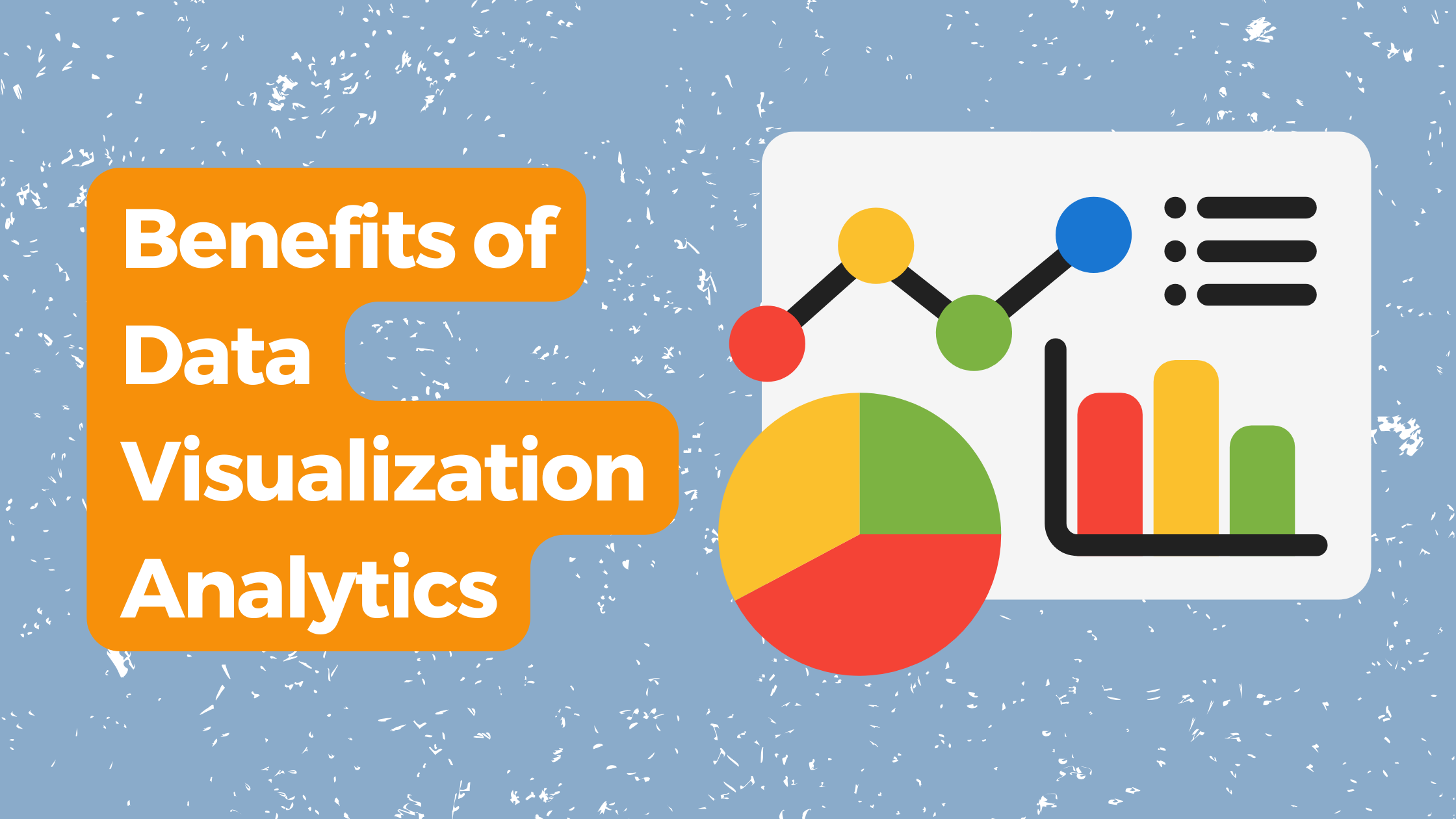
Benefits of Data Visualization Analytics in Inventory Management
Let’s understand the importance of data visualization in ecommerce first. The sheer amount of data generated by ecommerce platforms and marketing software overwhelms the possibilities of marketers. This puts them under a realization that without real-time, combined feed, they are left in darkness:
- While 58% of marketers find success, there’s still room for improvement for the remaining 42%
- While 29% experience seamless results, there’s a significant gap for the remaining 71% regarding automation effectiveness.
Imagine wanting to truly understand your customers. This becomes significantly easier when you have integrated charts and graphs displaying their age, gender, location, preferences, interests, and transactional data, all on a single screen.
Instead of sifting through spreadsheets and reports, you have a visual snapshot of your customer base, allowing you to quickly identify trends and patterns. This data can then be used to personalize your marketing messages, tailor product offerings, and improve customer service.
Improved Data Analysis: Data visualization analytics tools allow you to analyze your inventory data in a more intuitive and efficient way. By presenting your data visually, you can quickly identify outliers, spot trends, and detect patterns that may not be immediately apparent in raw data.
Enhanced Decision Making: With data visualization analytics, you can make more informed decisions about inventory replenishment, demand forecasting, and pricing strategies. By visualizing your inventory data, you can identify which products are selling well, and are underperforming, and adjust your inventory levels accordingly.
Efficient Monitoring: Data visualization tools enable you to monitor your inventory performance in real-time. By creating interactive dashboards, you can track key performance indicators (KPIs) such as stock levels, turnover rates, and sales velocity. This enables you to proactively address any issues and optimize your inventory management processes.
Improved Collaboration: Data visualization tools facilitate collaboration and communication among team members. By sharing visualizations and reports, you can align your inventory management strategies and ensure that everyone has access to the same up-to-date information.
Introducing Inventory Source’s Data Visualization Tools
Inventory Source is a leading provider of inventory management solutions, offering a comprehensive suite of data visualization tools designed to help businesses optimize their inventory management processes. With Inventory Source’s data visualization analytics tools, you can easily spot inventory and sales trends and patterns, enabling you to make data-driven decisions and maximize your profitability.
Inventory Source’s Bar Charts and Line Charts
Bar charts and line charts are fundamental tools for visualizing inventory data. Bar charts are ideal for comparing values across different periods or locations, while line charts are great for showing changes or trends in a single variable over time. By using Inventory Source’s bar charts and line charts, you can easily identify seasonal fluctuations in demand, monitor inventory turnover rates, and make informed decisions about inventory replenishment.
Inventory Source’s Pie Charts and Histograms
Pie charts and histograms are powerful tools for understanding the composition and distribution of your inventory. Pie charts can show the proportions or percentages of different categories within a whole, allowing you to identify your top-selling products or analyze the distribution of products across different categories. Histograms, on the other hand, provide a visual representation of the frequency or distribution of a variable. By using Inventory Source’s pie charts and histograms, you can gain valuable insights into your inventory composition and make informed decisions about product assortment and pricing strategies.
Inventory Source’s Scatter Plots and Heat Maps
Scatter plots and heat maps enable you to analyze the relationship between two variables and identify spatial patterns in your inventory data. Scatter plots are particularly useful for identifying correlations between variables, such as the relationship between price and sales volume. Heat maps, on the other hand, can display the intensity or density of a variable across a geographic area, allowing you to identify regional sales trends and optimize your distribution strategy.
Inventory Source’s Dashboards and Reports
Inventory Source’s data visualization tools also include comprehensive dashboards and reports that provide a holistic view of your inventory performance. Dashboards combine multiple charts and graphs into one screen, enabling you to monitor key performance indicators at a glance. With Inventory Source’s dashboards, you can track stock levels, sales velocity, and other important metrics in real time, ensuring that you have a clear understanding of your inventory performance. Additionally, Inventory Source’s reports generate detailed summaries of your inventory data, allowing you to analyze historical trends, identify areas for improvement, and share valuable insights with stakeholders.
Conclusion
Data visualization analytics provides a powerful toolset that allows you to gain valuable insights into your inventory performance, identify trends and patterns, and make data-driven decisions. Inventory Source’s data visualization tools empower you to harness the power of visual representation and optimize your inventory management processes.
By leveraging Inventory Source’s bar charts, line charts, pie charts, histograms, scatter plots, heat maps, dashboards, and reports, you can stay ahead of the competition, maximize your profitability, and achieve long-term success in the dynamic world of inventory management.
So, are you ready to unlock the full potential of your inventory data with Inventory Source’s data visualization tools? Start your journey towards optimized inventory management today and experience the transformative power of data visualization analytics.
Discover the Power of Inventory Source: An Introduction Video
Recent Articles

How Unified Asset Intelligence Powers Smarter Business Strategy for SaaS Startups
Learn how unified asset intelligence gives SaaS startups real-time visibility into hardware, software, and cloud assets to reduce costs and scale efficiently.

Is Dropshipping Dead in 2026? Data, Automation & the Shift to Compliant Niches
Discover why dropshipping isn’t dead. Learn how automation, APIs, compliance, and niche selection drive growth in 2026.

The Ultimate Dropshipping Supplier API Checklist: From Firearms to Medical Supplies
Learn how a dropshipping API automates supplier integrations, inventory synchronization, order routing, and catalog management at scale.