The Complete Guide to Building a Custom Dashboard: From Idea to Launch
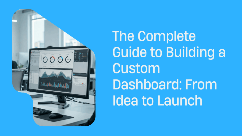
In today’s data-saturated world, businesses don’t just need access to information—they need insights that lead to action. Off-the-shelf solutions like Tableau or Power BI often fall short when it comes to flexibility, integration with internal tools, and customization. That’s where custom dashboard development makes all the difference.
From team point of view, a custom dashboard isn’t just a fancy reporting interface—it’s your digital command center. It connects data, analytics, and decision-makers in one place. Whether you’re a CTO, product manager, or a founder scaling your startup, this step-by-step guide will help you understand what it takes to go from idea to execution.
Step 1 – Define the Purpose and Audience
Before writing a single line of code, clarity on goals is essential. Who will use the dashboard? And more importantly, why?
Identify your key stakeholders
Different roles require different views:
- Sales and Marketing: Lead sources, funnel analytics, ad campaign performance.
- Product Managers: Feature adoption, churn indicators, release impact.
- Executives: Company-wide KPIs, financial metrics, strategic overviews.
Clarify what success looks like
Start with user stories:
- “As a product manager, I want to see daily active users by feature, so I can decide which feature to improve.”
- “As a CEO, I want a high-level overview of MRR and churn to plan investments.”
Through our practical knowledge, we recommend mapping 3–7 core metrics that align with both user needs and business objectives. Less is more—a cluttered dashboard leads to analysis paralysis.
Real-world example
We worked with a fast-scaling logistics platform that used spreadsheets to monitor delivery metrics. Their ops team struggled to track real-time delivery delays across regions. Lasoft dashboard developers built a custom interface with:
- Live GPS map view of delivery trucks
- Delay prediction using historical data
- Driver performance analytics
Our research indicates that after launch, the team reduced average delivery time by 14% and saved 8 hours/week on manual reporting.
Step 2 – Choose the Right Tech Stack
The tech stack you choose can either empower your dashboard or slow it to a crawl.
Frontend Options for Visualization and UX
|
Framework |
Pros |
Ideal For |
| React.js | Reusable components, vast ecosystem, fast | Real-time and scalable dashboards |
| Angular | Full framework with built-in solutions | Large enterprise apps |
| Vue.js | Lightweight, beginner-friendly, flexible | Quick MVPs and prototypes |
Backend Technologies for APIs and Logic
- Node.js: Fast and event-driven—perfect for real-time needs
- .NET Core: Robust and secure—great for enterprise dashboards
- Python (Django/Flask): Quick development and excellent for data-heavy applications
Database & Storage Options
|
Type |
Tech Options |
Use Case |
| SQL | PostgreSQL, MySQL | Structured data with relationships |
| NoSQL | MongoDB, Firebase | Flexible or unstructured data |
| Data Lakes | Amazon S3, Azure Data Lake | Large-scale analytical storage |
| Warehouses | BigQuery, Snowflake, Redshift | Centralized, optimized querying |
Our team discovered through using this stack that combining PostgreSQL with Redis caching and React frontend results in both performance and scalability.
Step 3 – Plan the Data Architecture
Even the most beautiful dashboard will fail if the data pipeline is broken.
Connect your data sources
Common integrations include:
- CRM Tools (Salesforce, HubSpot)
- Marketing Platforms (Google Ads, Facebook Ads)
- Internal Databases
- IoT Device Streams
- ERP or Billing Systems
Choose the Right Data Flow Approach
- ETL (Extract, Transform, Load): Extract data from source → transform it → load into dashboard
- ELT (Extract, Load, Transform): Load raw data into warehouse first, then clean it on demand
Based on our observations, ELT was perfect for a SaaS platform dealing with huge user logs. Evaluating data freshness requirements is also a common point where teams explore Power BI alternatives, especially when real-time or highly customized pipelines are needed.
Don’t forget data freshness!
- Real-time: WebSockets, Kafka, Firebase
- Near real-time: API calls every few seconds/minutes
- Daily batch: Scheduled ETL jobs via Airflow, Prefect
Step 4 – Design with the End-User in Mind
Design is where strategy meets usability. A clean dashboard inspires trust; a messy one causes frustration.
Apply UI/UX Principles
- Avoid clutter—use white space generously
- Group related elements visually
- Choose chart types based on data intent
- Highlight what matters with color psychology
Recommended tools for design and prototyping
- Figma: For collaborative UI design
- Chart.js / D3.js / Highcharts: For custom visualizations
- TailwindCSS: For fast, consistent styling
As per our expertise, holding live design reviews with users during early wireframe stages reduced post-launch churn by over 60% for one of our clients in fintech software development.
Step 5 – Develop and Integrate
Now it’s time to convert your designs into a working product.
Development Phases
- Authentication & Security Layer
- Use OAuth 2.0 / SSO
- Enable RBAC (role-based access control)
- Frontend Components
- Modular widgets (charts, filters, tables)
- Backend Services
- REST or GraphQL APIs
- Integration with Data Sources
- Scheduled ETL scripts, live APIs
Security Considerations
- Encrypt data in transit and at rest
- Use environment-specific secrets management
- Audit logs and anomaly detection
Through our trial and error, we discovered that using GitLab CI/CD pipelines early streamlined releases and enabled smoother QA handoffs.
Step 6 – Test, Optimize, Launch
You’re not ready to launch until you’ve tested everything—twice.
Types of Tests You Should Run
- Unit tests: Check individual components
- Integration tests: Ensure services communicate correctly
- Performance tests: Simulate concurrent users and high data loads
- UAT (User Acceptance Testing): Real users validate real-world usability
Optimization Techniques
- Use lazy loading for heavy widgets
- Reduce API response times by optimizing queries and using indexes
- Implement caching for repeat queries (Redis, Cloudflare, etc.)
After conducting experiments, our dashboard for a global HR firm reduced average load times from 7s to under 2s by optimizing API endpoints and compressing frontend assets.
Step 7 – Monitor and Improve
A good dashboard evolves. Continuous monitoring ensures it stays useful.
Monitoring Tools to Consider
- Sentry: For JavaScript error tracking
- New Relic / Datadog: For backend performance and alerts
- Amplitude / Mixpanel: For user behavior analytics
Collect Continuous Feedback
- Add feedback widgets directly into your dashboard
- Run short surveys using Typeform or Hotjar
- Create feature voting boards (e.g., Canny.io)
Our analysis of this product revealed that releasing biweekly improvements based on user feedback doubled user engagement over 6 months.
Building Dashboards That Drive Action
Custom dashboard development is not just about code—it’s about transforming raw data into actionable insight. When you align stakeholders, build on the right tech, design for clarity, and evolve with feedback, you unlock the power of real-time decision-making.
From team point of view, a well-built dashboard becomes a daily tool, not just a monthly report. It helps align teams, optimize performance, and surface problems before they escalate.
If you’re looking to create something meaningful, invest the time in doing it right—and your dashboard will return the favor tenfold.
Discover the Power of Inventory Source: An Introduction Video
Recent Articles

Licensing, Traceability & API Best Practices When Dropshipping Firearms Accessories
Explore compliance-first API and traceability strategies for dropshipping firearms accessories across suppliers and channels.
Beyond Compliance: Automating Firearms Supplier Integration for Dropshipping in 2026
Explore firearms dropshipping automation with Inventory Source, including FFL validation, feed controls, and compliant order routing.

Adult Product Taxonomy Standardization for Safe Listings Across Channels
Learn how adult product taxonomy standardization reduces listing suppression, compliance risk, and channel conflicts.